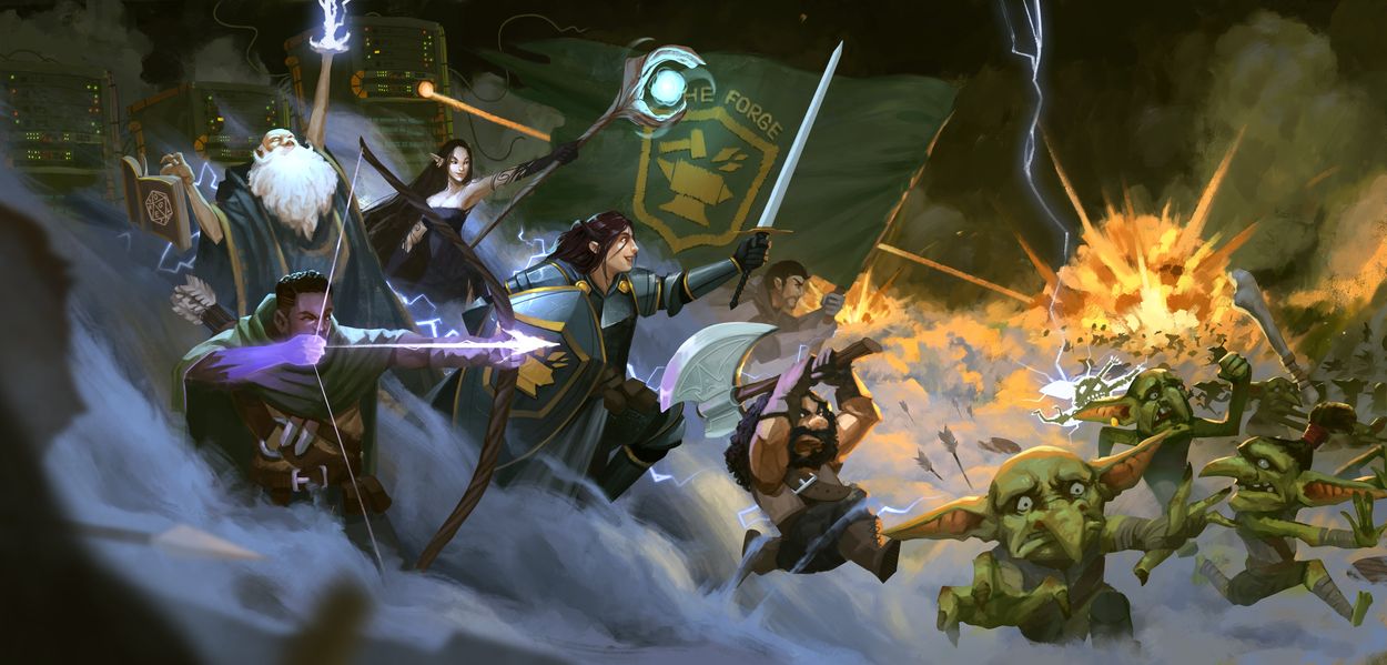
by DestinyGrey
In early summer 2021, it was clear The Forge was no longer a fledgling company. Our user numbers had exploded, and correspondingly, so had the demands our company faced. Much of 2021 was spent upgrading our scaling capabilities, and other stability improvements that long-time users may remember. Something that might have been missed however, is the amount of visual overhaul that our website went through. Just as we had to improve the scaling of our servers, we faced the challenge of scaling up the website appearance.
The original website appearance was cobbled together, assembled in haste to get The Forge released, and ready for new users to Foundry VTT. To be sure, the website wasn't hopeless- and most importantly, it was secure- but it lacked many UI elements taken for granted on the new website.
The front page was clunky, for lack of a better word. There was no true central banner image, with the banner instead taking the form of our old logo, along with "The Forge" superimposed in front of a map in Foundry VTT. While good at evoking the early charm of Foundry VTT, the image is vastly inferior to our current front page banner, not to mention how hard it was to read the text.

Mobile appearance was another major issue with our old website design. While Foundry VTT, and The Forge by extension are intended for non-mobile usage (laptop, desktop), the truth is that many users will be accessing both via tablet, laptop, or other small-screened device. While the front page design did scale for users with smaller screens, the appearance was not ideal.
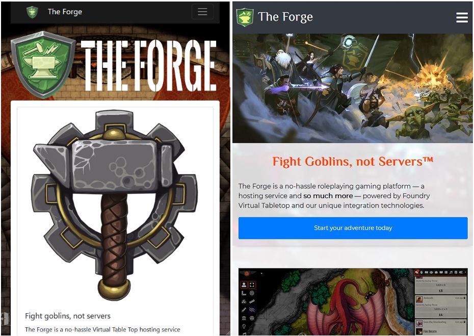
Our banner looked even worse zoomed in, and on a smaller screen, could be borderline unreadable. It was not a bad banner. But it needed to be better, given the increased scope of our business.
The front page banner became a prominent symbol of our evolution, in the minds of the Forge staff. Just as the website needed redesigned, we needed something more emblematic of The Forge. We needed something showy, to go along with our upcoming website overhaul. We needed a new banner, designed for our company.
The Banner
The idea started out vague. We wanted something that resembled the art style and scope of something you might find on an official rulebook cover, but with elements in the image that screamed "The Forge". The unofficial motto of our business- Fight Goblins, Not Servers- quickly came to mind.
An idea was proposed of an image depicting adventurers chasing after panicked goblins, while monolithic servers blasted the wayward goblins. To this end, our marketing consultant drew a great sketch (pictured below) that quickly became the template for the commission we sought to order, and inspiration for our future front page.
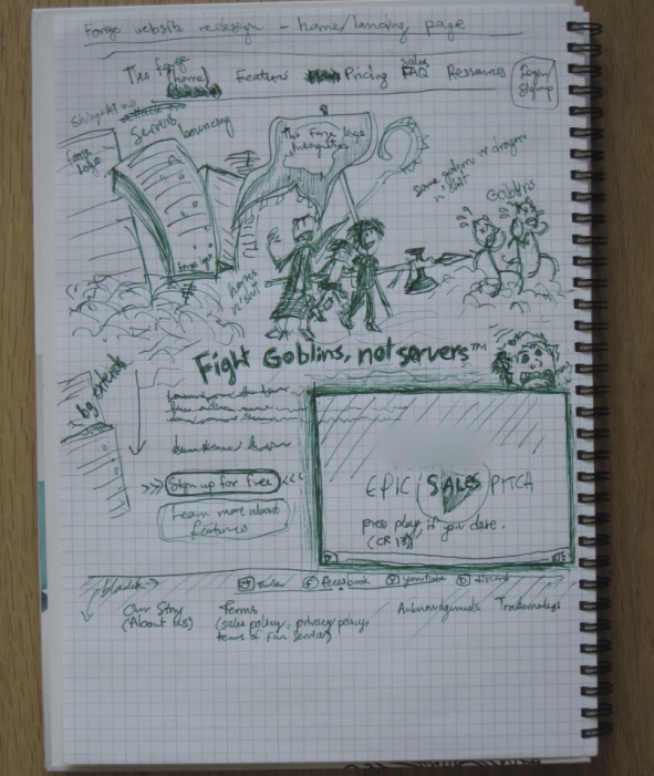
The idea and sketch were amazing, and we began a search for artists to commission. We quickly ran into a problem with the search. It was hard to find artists who could draw exactly what we were looking for. We began trawling through social media, and compiling a list of every artist we could find who offered commissions, and who fit our criteria.
Quite obviously, this was an expansive list, even though we were selective about the artists we chose. A spreadsheet was created, detailing the various strengths and weaknesses of each artist, along with columns to allow each staff member involved to offer input. After a few days and some debate, we settled on an artist.
thuan nguyen (sic) stood out as the best choice. He had shown a wide range in his drawings, with art depicting traditional D&D monsters, adventurer's cozily sitting around a fire, and even futuristic art. He was everything we were looking for in an artist. And so we reached out.
The Commission
This was our first time commissioning an image like this directly. We had only ever held art contests before, or commissioned the art from existing staff. We tried to keep it as simple as could reasonably be expected, and asked for the below:
- Full commercial and exclusive rights to the image. As explored in the concept art above, we wanted something that didn't only look good, but had Forge theming around it. We wanted people to see this image and any derivative art and immediately think "The Forge". And thus, we didn't want other businesses taking it.
- Similarly, we wanted the editing file for the image, in case we wanted to make derivative content based off the banner art.
- As established before, we wanted an image something like what you might find on a rulebook cover- understandably, a much more complex, and demanding task than typical party art commissions that might be made. This called for rich surroundings, dynamic poses, and a sense of scale.
- And perhaps most importantly, we wanted to show a diversity of people within the art. As we see it, tabletop roleplaying games are for anyone. Regardless of gender, skin color, or other personal descriptor, we wanted to make sure to show that our platform could be for anyone, as long as the account owner is over 13 years of age.
Thuan was immediately cooperative. He gave a prompt (and very fair) quote for the image, and promised us an update, along with an initial planning sketch within a week. And Thuan did successfully deliver as promised. It's a shame we never received his email.
Redesign Week
At the same time we were commissioning this banner, we were redesigning the website, having set for ourselves a goal to have it completely redesigned by our upcoming livestream. It was a panicked development, and stressful for those involved. Adding to this stress was the fact we hadn't heard from Thuan for a week after his promised first sketch.
As it turns out, an email had been sent with the attachment. Unfortunately, the email service used did not send the email, nor did it warn Thuan that the sent email had failed.
We only found this out a week later. As a result, we were left with the very real prospect that we might not have a banner image ready in time for the developer update, and launch of the new Forge website. Thankfully, this is where Thuan came through.
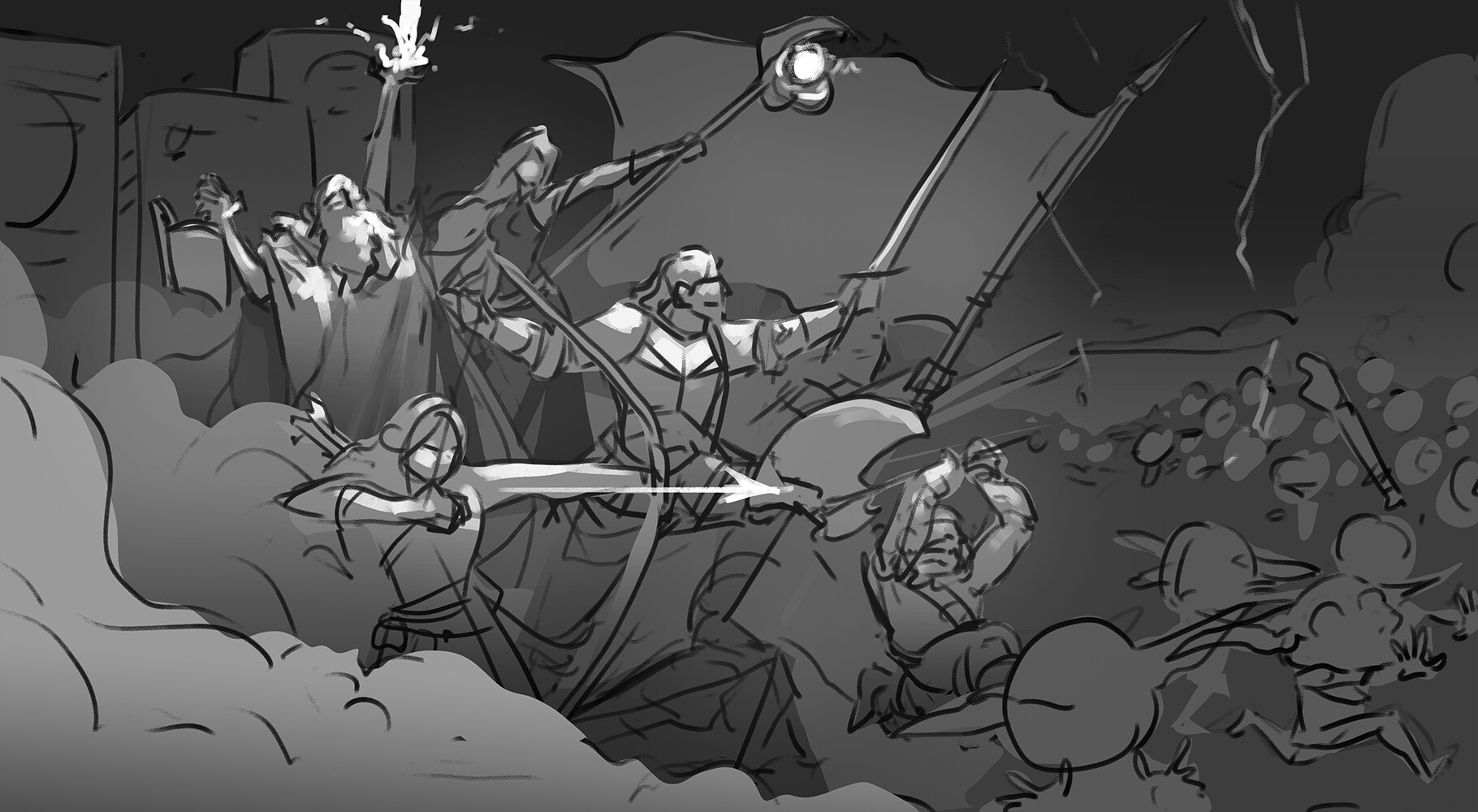
As we ironed out the misunderstanding and established that we were still interested in this commission, we gave feedback on his image, and within a few days, immediately had the next draft. Thuan was lightning quick with each new image's iteration. We asked that Thuan add an explosive laser beam shooting out of a server, and it was added in the next iteration. We asked that the server machines be made closer to actual servers in appearance, and it was done. Ironically, the banner image was one of the few aspects of the redesign to happen in time.
You can see the drafts Thuan made for us on his Artstation page. As may be noticed, we didn't go through many iterations. Thuan did a good job of understanding when to move forward, and what details needed adding that we hadn't thought of. These details brought the scene to life.

And thus, with a few days to spare and an incredible image in our hands, we paid Thuan, and received the full banner image and working file. Unsurprisingly, its debut in the livestream was a popular success.
Using the Banner
Our banner proved a valued addition to the website, and thanks to Thuan's work in providing us the working file, has grown into something we've used over and over. During our visit to Pax Unplugged, we gave out business cards depicting a more compact version of the banner to each and every creator we could find.
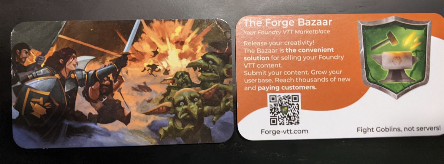
More generous users might notice we also use the character art for our gift cards on The Bazaar.

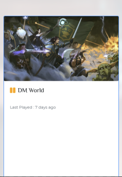
And of course, it's also the default image for new worlds created on The Forge. We like to think it gives a useful sense of adventure to any Foundry VTT world.
Final Remarks
Most users are blissfully unaware of the struggles that go into redesigning a website. We'd advise to anyone undertaking a similarly large project requiring commissioned art to commission it far ahead of schedule- it was only through luck, and the work effort of our artist that we got it in time for the website overhaul.
And yet somehow, the banner commission wasn't the most consuming, or late part of the website redesign. Stay tuned for more details of the adventure that was the website's actual overhaul.
